Menu makeover gallery · 6 real restaurants

Restaurant menu redesign,
before and after.

Six real restaurants. Six professional menu makeovers built from their actual menus — same dishes, same prices, completely transformed design. See what changes when hierarchy, brand fit, and sell-more architecture replace generic templates.

Start with a $49 watermarked preview — credited in full toward the $149 complete package when you decide to print.

Redesign your menu free in minutes →Get $49 preview

Catch 109

Morehead City, NC  ·  Waterfront seafood restaurant

Focus: Hierarchy, brand fit, and scanability

BeforeOriginal menu
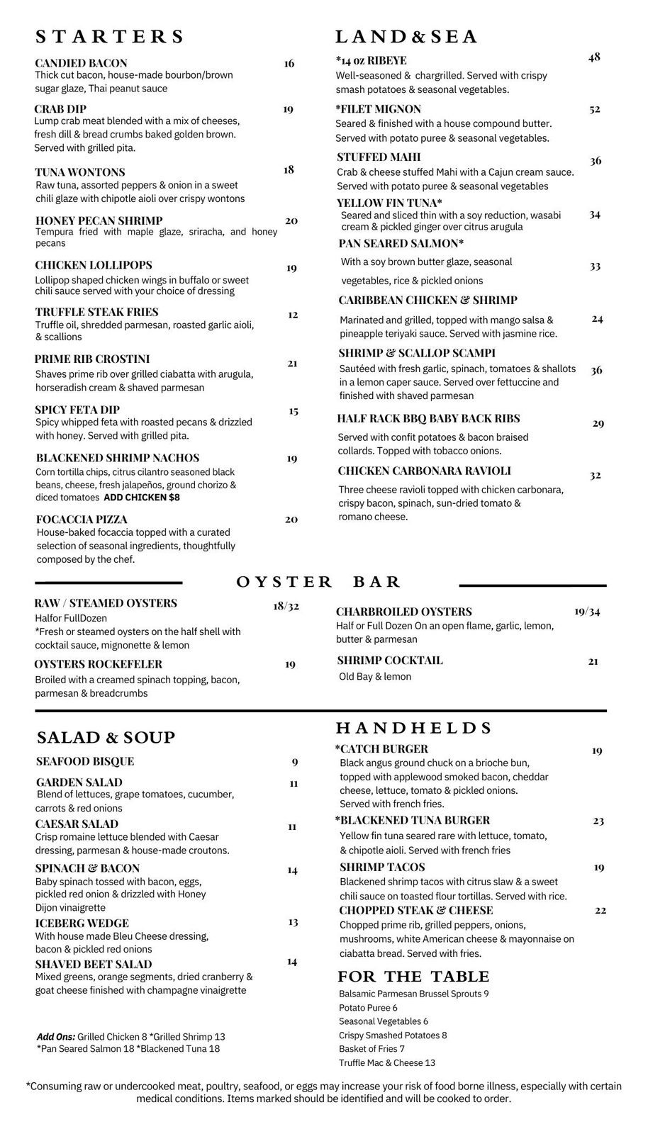
Catch 109 original menu — dense, text-heavy layout with no coastal atmosphere
AfterMenuist redesign
Open full PDF →

Creative director note

The original was a wall of type: no whitespace, no coastal identity, no reason to linger. The makeover introduced a clean editorial hierarchy — generous breathing room between sections, one refined serif that signals quality, and a structure that draws the eye from starters to mains without competing for attention. Guests scan it in seconds. Staff upsell with confidence.
The Victor Cafe

Philadelphia, PA  ·  Italian opera café — est. 1918

Focus: Heritage identity and sell-more architecture

BeforeOriginal menu
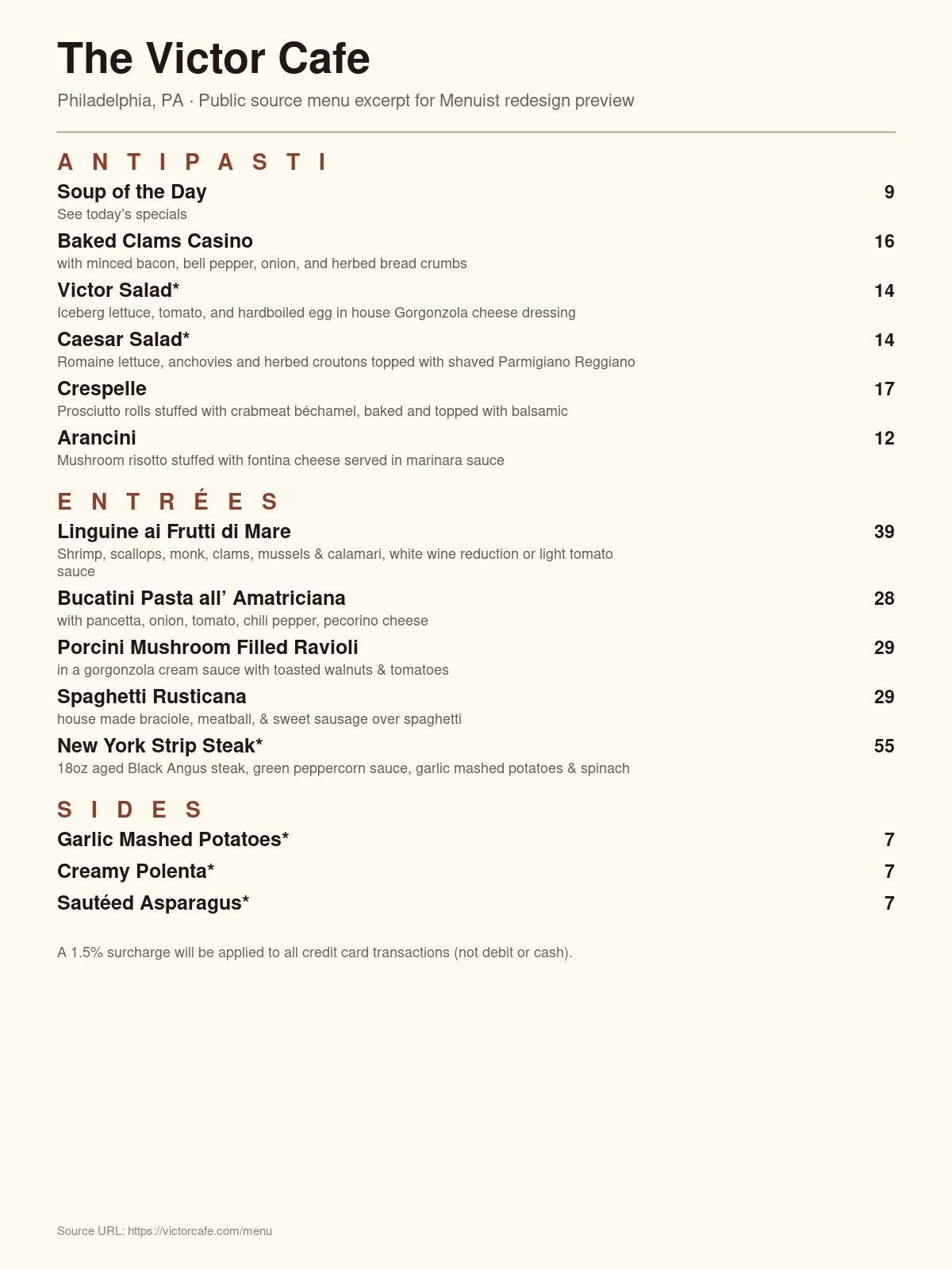
Victor Cafe original menu — flat listing-style layout with no heritage presence
AfterMenuist redesign
Open full PDF →

Creative director note

Victor Cafe has hosted opera singers at the table since 1918. The original menu looked like a typed list — no presence to match the legend. The makeover applied a heritage broadside treatment: operatic type hierarchy, warm ivory tones, and a section order that puts high-margin dishes in the prime reading positions. The menu now matches the room.

Butterjoint

Pittsburgh, PA  ·  Craft bar and kitchen

Focus: Editorial restraint and craft positioning

BeforeOriginal menu
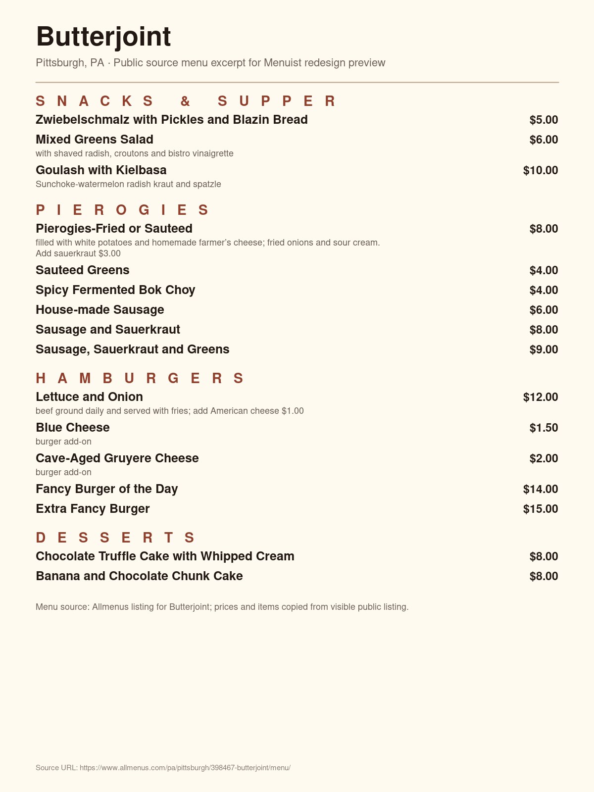
Butterjoint original menu — functional text-only bar menu with no visual identity
AfterMenuist redesign
Open full PDF →

Creative director note

A working bar menu that did the job and nothing more. The makeover applied editorial restraint: sharp weight contrast between section headers and items, deliberate spacing that feels curated rather than listed, and a tone that suits a serious craft-beer culture. The result looks like a menu from a place that takes what it serves seriously — because it does.

Sally's on Broadway

Springville, IA  ·  Neighbourhood family diner

Focus: Warmth, clarity, and repeat-visit feeling

BeforeOriginal menu
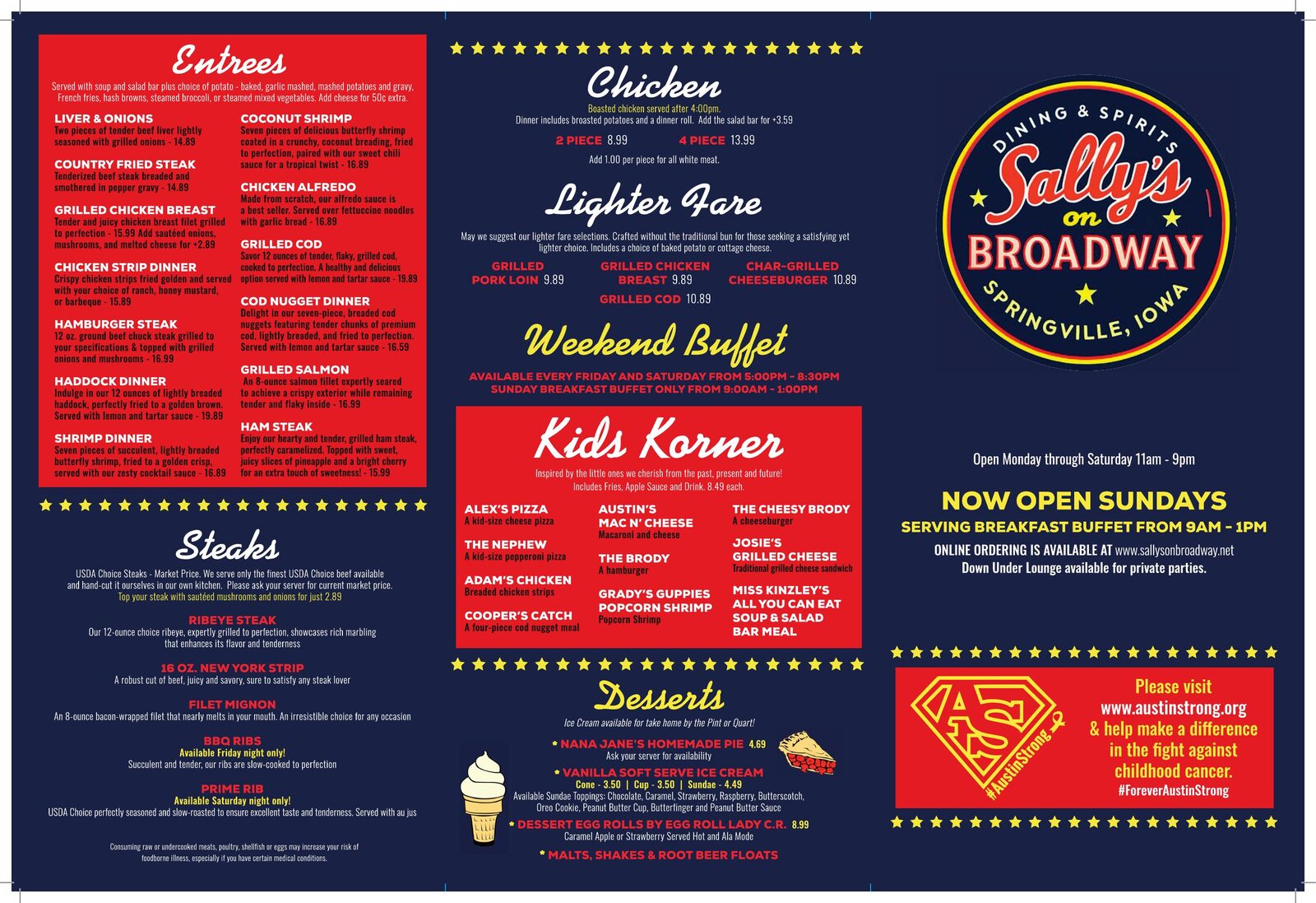
Sally's on Broadway original menu — busy multi-panel print layout with boxed sections
AfterMenuist redesign
Open full PDF →

Creative director note

Multiple competing panels, boxed sections, small type — the original menu made ordering feel like a task. The makeover distilled it into a single-column hierarchy: clear section headers, room to breathe between items, and a warmth that says 'we know you here.' The kind of menu that makes guests feel like regulars from the first visit.

The Border Mexican Restaurant

Cedartown, GA  ·  Family Mexican restaurant

Focus: Brand fit and visual identity over stock templates

BeforeOriginal menu
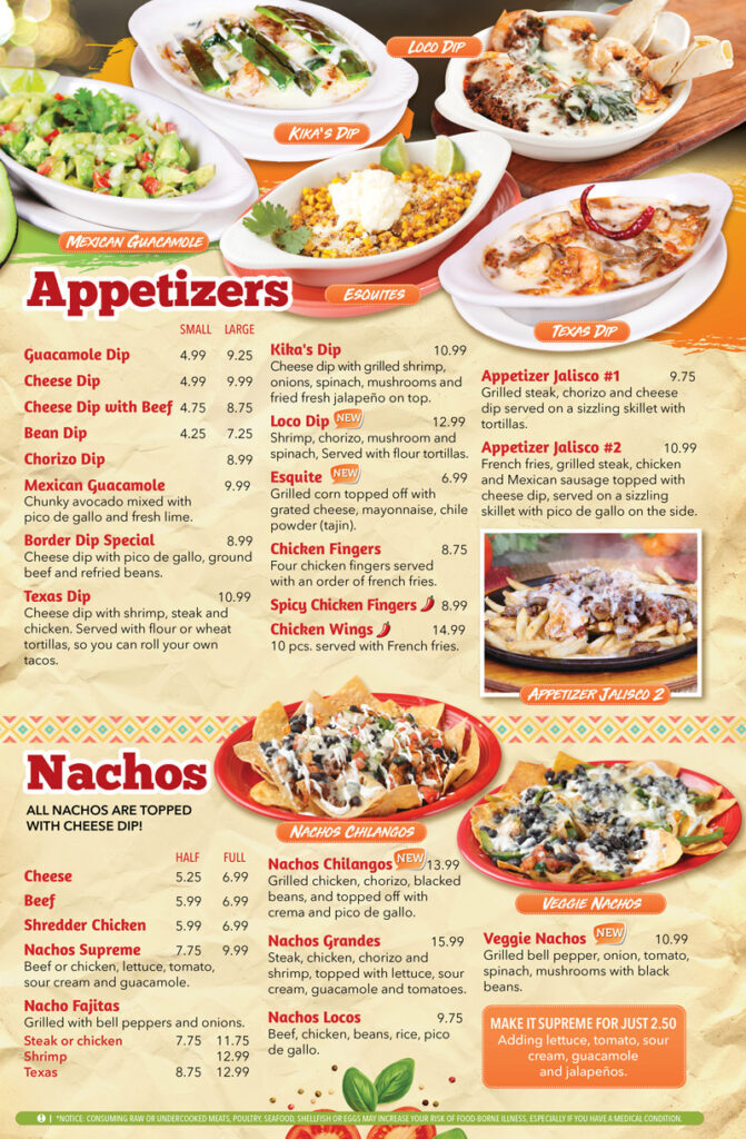
The Border original menu — photo-heavy template with competing colors and price blocks
AfterMenuist redesign
Open full PDF →

Creative director note

An off-the-shelf template with clashing colors, overpowering stock photography, and price blocks that fought the dish names. The makeover replaced the visual noise with an earthy, composed palette — ochre, warm terracotta — and a layout that lets the cuisine lead. The result feels like a real cantina, not a franchise.

Totopos Mexican Restaurant

Dallas, GA  ·  Authentic Mexican cantina

Focus: Bold brand identity and confidence

BeforeOriginal menu
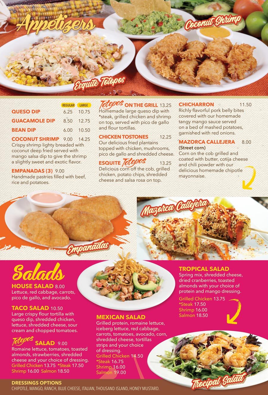
Totopos original menu — colorful generic template with many photos and competing labels
AfterMenuist redesign
Open full PDF →

Creative director note

The original leaned on stock photography and generic label typography — a template that fit any restaurant and therefore represented none. The makeover built a bold cantina identity from the ground up: confident display type, an ochre-and-terracotta palette, and a layout architecture that puts cuisine front and centre. The menu finally matched the kitchen's ambition.

Your restaurant is next

Redesign your menu free in minutes

No design skills needed. Upload your current menu, answer a few questions, and see your makeover live. Start with a $49 watermarked preview — credited toward the $149 full package.

Redesign your menu free →$49 preview →

Professional menu design

Stop leaving money on the table with a menu that doesn't do its job.

Every restaurant above used their existing menu. No copywriter, no photographer. Just AI-powered design that fits your cuisine, your atmosphere, and your customers.

Redesign your menu free in minutes →Get $49 watermarked previewFull menu — $149 (preview credited)

$49 preview credited in full toward the $149 complete package